Designing for Billions: Transforming Western Union’s B2B Payment Experience
How my work moved key KPIS and positioned the company for private equity acquisition.
Overview
Though the company had been in existence for more than 150 years, Western Union had never had a design team that was focused strictly on its B2B offerings. It’s remarkable in some ways that they had managed to create a payment system that processed $180 billion in cross and border business to business payments each year without having a dedicated design team to support and drive new innovation.
When I was hired as the first Manager of UX/UI design for Western Union’s B2B money transfer services, I inherited payment system with sizable usability and user interface gaps.
Goals
Our first priority was to identify the user experience gaps that were causing the most pain for our users. After establishing a system that would allow us to gather significant quantitative data about how our users were using and sometimes failing to use our system, we conducted an extensive round of usability testing and user interviews to help us understand our users wants, goals, needs, and pain points.
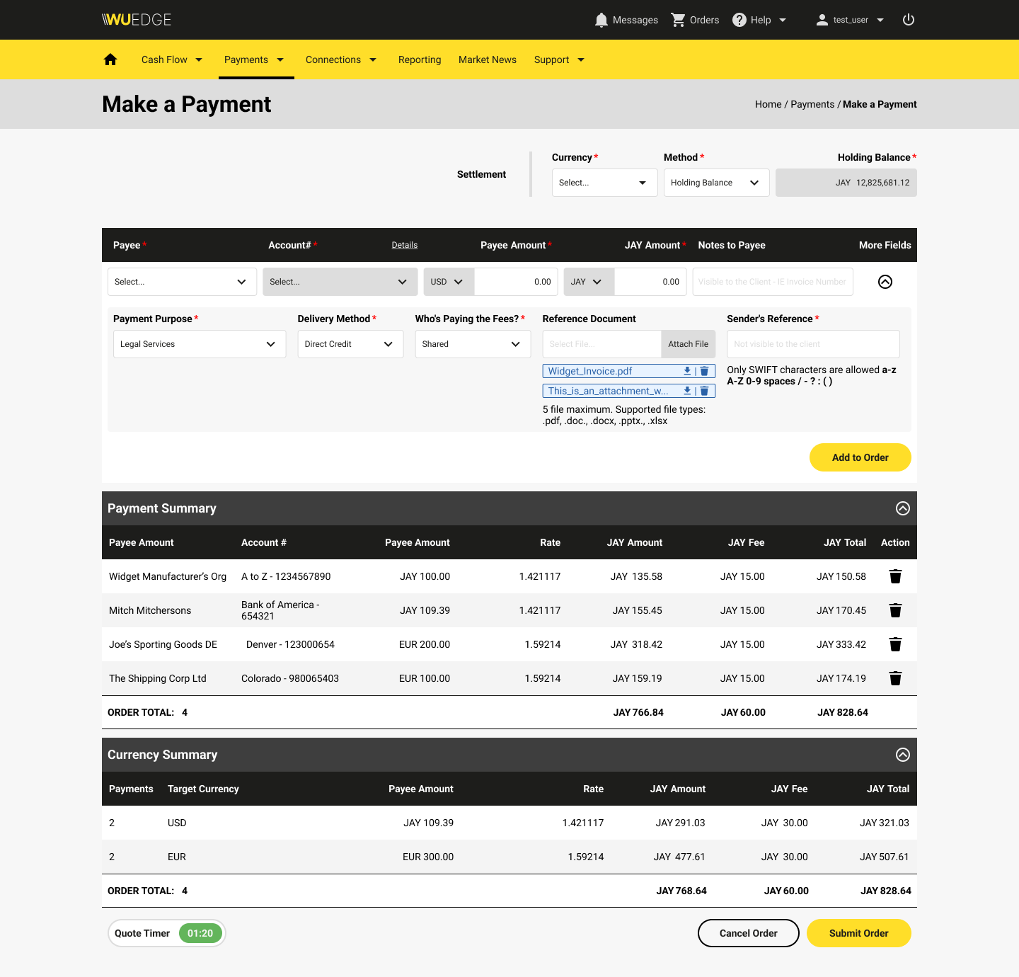
After our initial user research was complete, we circled back with our business stakeholders to form our product strategy. Our biggest gap lay in our our main UI for cross-boarder money payments. We worked hard to create a new system that not only met all of our users needs but improved the technical approach to the design process that allowed us to reduce the number of task abandons significantly.
Role
UX/UI Manager
Scope
Product Design
Design Leadership
UX Research
UX Design
UX Testing
QA Testing
Timeline
Dec. 2020 – Dec. 2021
Tools
JIRA
Material Design Libraries
Figma
Google Analytics
Quantum Metric
Key Metrics
Working with my key internal stakeholders in the executive leadership and customer experience spheres, we identified several target KPIs that would define success for the project:
- Abandonment Rate
- Average Time to Task Completion
- Carts with Multiple Payments
- Page Loading Times
Research Process
Our first priority was to identify the user experience gaps that were causing the most pain for our users. After establishing a system that would allow us to gather significant quantitative data about how our users were using and sometimes failing to use our system, we conducted an extensive round of usability testing and user interviews to help us understand our users wants, goals, needs, and pain points.
After our initial user research was complete, we circled back with our business stakeholders to form our product strategy. Our biggest gap lay in our our main UI for cross-boarder money payments. We worked hard to create a new system that not only met all of our users needs but improved the technical approach to the design process that allowed us to reduce the number of task abandons significantly.
Design Process
I worked with my team to create a re-designed workflow that leveraged our newly-established design system, created as an artifact of this project speed up the design and development process, to create new designs that eliminated key pain points in the process, including:
- Improving discoverability and findability of multiple-payment options.
- Decreasing page load times by creating design that functioned independent of load-heavy iframes.
- Reduced the number of clicks required to complete a payment.
- Streamlining the information architecture for reduced cognitive load and easy task completion.
- Adjusted language to match industry-standard terms to reduce confusion and cognitive load.
Impact
Through post-deployment quantitative data analysis, we were able to determine these impacts, all of which exceeded stakeholder expectations:
- Abandonment Rate: 60% reduction
- Average Time to Completion: 58% reduction
- Carts with Multiple Payments: 1,175% improvement
- Page Loading Times: 97% reduction
Learnings
For a company that was new to a product design practice that featured user-centric, data-driven approaches, this project was a big win. Not only did it have a large impact on our business, it showed how taking extra time to understand our users wants, goals, needs, and pain points added additional value.
This project was also a big success from getting both our team and our stakeholders used to our process. With a small team of 2 UX professionals in Denver, 2 UI professionals, and various stakeholders in support, marketing, dev, etc. scattered across 5 time zones, it helped to establish rhythms that set up success for future projects.
Shorty after our re-design work was finished, Western Union Business Solutions was purchased by private equity partners, with the work we did on refining and optimizing the digital payment platform identified as a key contributor to the success of the acquisition.